DocsThe builder
Responsive design and breakpoints
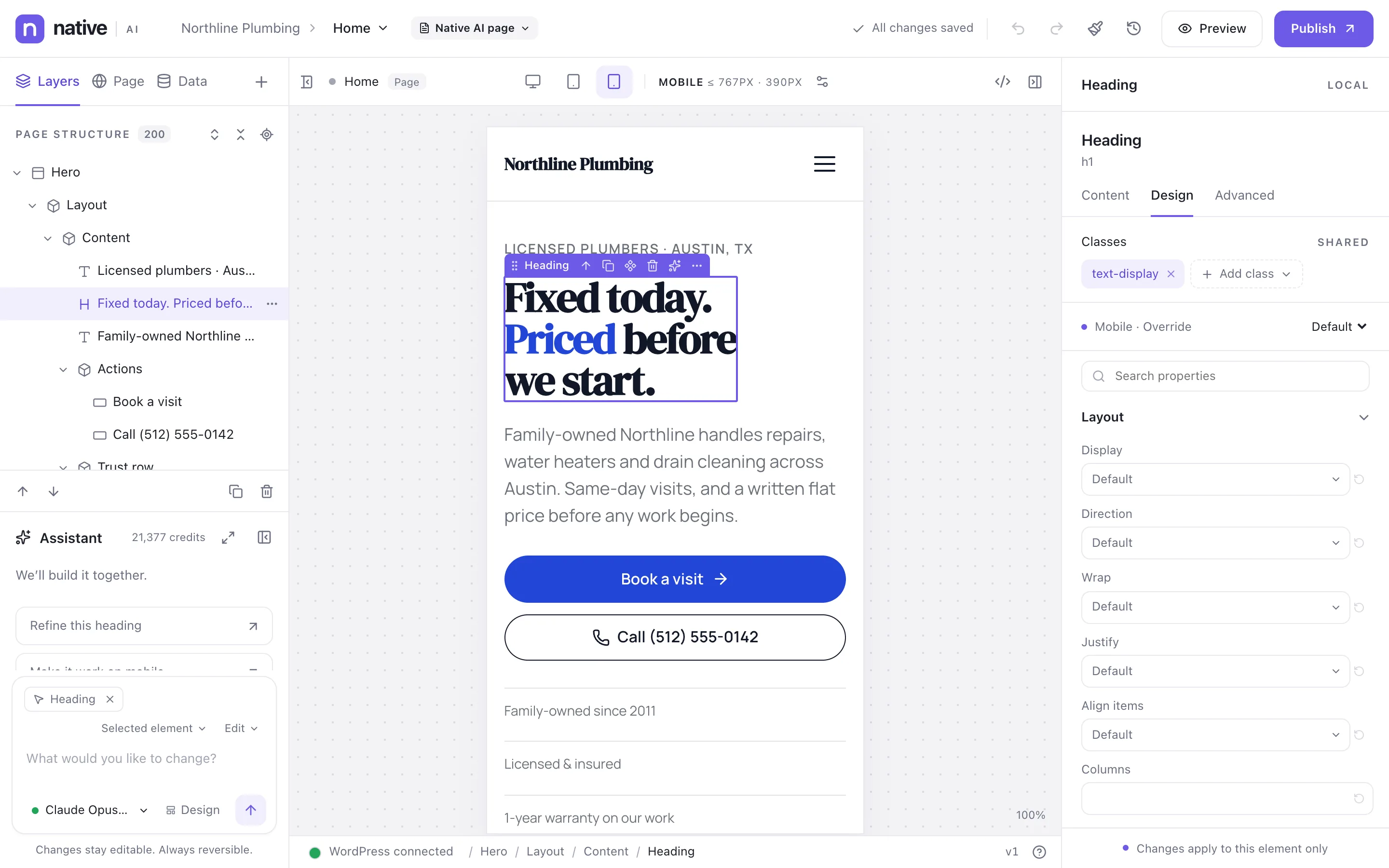
Style for desktop, tablet and mobile — and any other widths you add. Styles flow down from desktop, so on smaller screens you only set what changes.
The default breakpoints#
| Breakpoint | Applies to | Canvas width |
|---|---|---|
| Desktop | Every width (the starting point) | 1440 px |
| Tablet | Up to 1023 px | 820 px |
| Mobile | Up to 767 px | 390 px |
Switch breakpoints with the buttons above the canvas. The label next to them (“DESKTOP 1440PX”) shows which breakpoint you’re styling and the width of the canvas.
How styles cascade#
- A style set on Desktop applies at every width, unless a smaller breakpoint sets something else.
- A style set on Tablet applies to tablets and phones, unless Mobile overrides it.
- Breakpoints for wide screens (such as Widescreen, from 1600 px) work the other way: they apply at that width and wider.
So you design once on desktop, then adjust only what needs to change on smaller screens.
Add, rename, resize or remove breakpoints#
Click Manage breakpoints next to the width label (or go to Native AI → Settings → Responsive). Presets you haven’t used yet are offered:
| Preset | Applies to |
|---|---|
| Widescreen | 1600 px and wider |
| Laptop | Up to 1279 px |
| Tablet landscape | Up to 1199 px |
| Tablet portrait | Up to 991 px |
| Mobile landscape | Up to 767 px |
| Mobile | Up to 479 px |
| Small mobile | Up to 359 px |
| Custom | Any width you choose |
Breakpoints belong to the design system, so changing them needs the Change the design system permission.
Hide an element on some screens#
In the element’s Advanced tab, use Hide on to pick the breakpoints where it shouldn’t show. The element stays dimmed on the canvas at those widths so you can still select it.
Menus on phones#
Each Menu element collapses into a menu button at the breakpoint you choose. See Menus and mega menus.
Related articles
On the features pages
Still have a question? Email us at support.