DocsThe builder
Interactions
Make elements respond to clicks, scrolling, forms and more without code: a trigger, optional conditions, and a sequence of actions on the elements you choose.
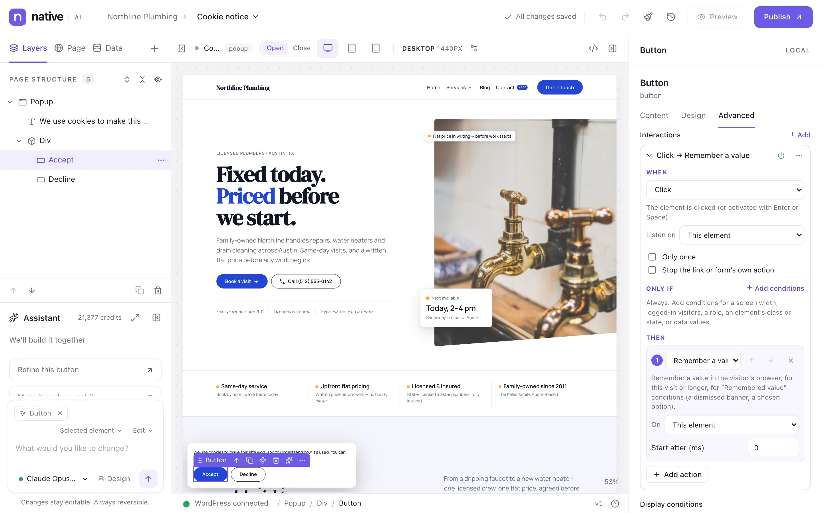
An interaction says: when something happens (the trigger), if these conditions are true, do these actions, on these elements. Open Advanced → Interactions on the element that starts it. An element can have up to ten.
Triggers#
30 triggers:
| Trigger | Group | When it runs |
|---|---|---|
| Click | Mouse | The element is clicked (or activated with Enter or Space). |
| Double click | Mouse | The element is double-clicked. |
| Hover (in and out) | Mouse | The pointer enters the element; leaving undoes the actions. Keyboard focus counts too. |
| Mouse enter | Mouse | The pointer enters the element. |
| Mouse leave | Mouse | The pointer leaves the element. |
| Click outside | Mouse | A click anywhere outside the element (closing menus and panels). |
| Focus | Keyboard | The element, or something in it, receives focus. |
| Blur | Keyboard | Focus leaves the element. |
| Key press | Keyboard | A key is pressed anywhere on the page (Escape, mod+k…). |
| Change | Forms | A field's value is changed. |
| Input | Forms | Someone types in a field. |
| Form submit | Forms | A form is submitted (before it's sent). |
| Form sent successfully | Forms | A Native AI form was submitted and accepted. |
| Page load | Page | The page and its images have loaded. |
| Page ready | Page | The page's content is ready (before images finish loading). |
| Window resize | Page | The browser window changes size. |
| Scroll past | Scrolling | The page scrolls past a distance (or an element with a target); with toggle, scrolling back undoes the actions. |
| Scroll into view | Scrolling | The element scrolls into view. |
| Scroll out of view | Scrolling | The element scrolls out of view. |
| Scroll progress | Scrolling | While the element crosses the screen, its targets get --nai-progress from 0 to 1 (use it in styles). |
| Popup opened | Builder elements | A popup, modal or off-canvas panel opens (a target: that one only). |
| Popup closed | Builder elements | A popup, modal or off-canvas panel closes. |
| Tab changed | Builder elements | A Tabs element shows another tab. |
| Accordion opened or closed | Builder elements | An accordion item opens or closes. |
| Slider changed | Builder elements | A slider or carousel moves to another slide. |
| Query Loop updated | Builder elements | A Query Loop loaded more records (Load more, infinite scroll). |
| Custom event | Custom | An event with this name (from another interaction's Emit, or a script). |
| Exit intent | Page | The visitor seems about to leave: the pointer heads for the tabs or the back button (on phones, a quick scroll back up). Once per page. |
| Inactivity | Page | No mouse, touch, keyboard or scroll activity for a while. |
| Time on the site | Page | The visitor has spent this long on the site in this visit (across pages). |
Actions#
27 actions. Each can start after a delay, so several actions form a timeline:
| Action | Group | What it does |
|---|---|---|
| Show | Show and hide | Show the element (starts hidden with “Start hidden”, or was hidden). |
| Hide | Show and hide | Hide the element. |
| Show / hide | Show and hide | Show it if hidden, hide it if shown. |
| Add class | Classes | Add a class. |
| Remove class | Classes | Remove a class. |
| Toggle class | Classes | Add the class if missing, remove it if present. |
| Set state | State | Turn a state (open, active, scrolled…) on, off or over. Style it with the state in the Design tab. |
| Change style | Style | Set CSS properties on the element. |
| Animate | Motion | Play a motion preset or a custom animation. |
| Scroll to | Navigation | Scroll the page to the element. |
| Open popup | Popups | Open a Popup, Modal or Off-canvas panel, or a Menu's mobile menu. |
| Close popup | Popups | Close it. |
| Toggle popup | Popups | Open it if closed, close it if open. |
| Set attribute | Content | Set an HTML attribute (aria-*, data-*, disabled…). |
| Remove attribute | Content | Remove an HTML attribute. |
| Change text | Content | Replace the element's text. |
| Change image | Media | Show another image. |
| Play video | Media | Play a video or audio element (or a YouTube or Vimeo embed). |
| Pause video | Media | Pause it. |
| Go to URL | Navigation | Open a URL (tokens allowed). |
| Copy to clipboard | Content | Copy text (or the target's text); the element gets the “copied” state for two seconds. |
| Focus | Forms | Move keyboard focus to the element. |
| Remember a value | State | Remember a value in the visitor’s browser, for this visit or longer, for “Remembered value” conditions (a dismissed banner, a chosen option). |
| Submit form | Forms | Submit the form the target is (or contains). |
| Trigger custom event | Events | Send an event other interactions (or scripts) listen for. |
| Track analytics event | Events | Count an event in Native AI Analytics (when the Analytics feature is on): a name like pricing_cta_clicked, an optional category and label. Make it a conversion under Analytics → Conversions. |
| Run JavaScript | Advanced | Advanced: run your own code with el, target, event and data. Needs the custom code permission. |
The Animate action plays any of these animations, or a custom one with your own frames, duration, easing, repeats and stagger:
- Fade in
- Fade out
- Fade up
- Fade down
- Fade from right
- Fade from left
- Slide up
- Slide down
- Zoom in
- Zoom out
- Scale in
- Scale out
- Blur in
- Flip up
- Reveal (wipe up)
- Lift
- Pulse
- Shake
- Bounce
- Wiggle
- Spin
- Custom
Targets#
Each action works on a target:
- This element
- What was clicked (the event target)
- Parent
- Children
- First child
- Siblings
- Next sibling
- Previous sibling
- An element (pick it)
- Element with HTML id
- Elements with class
- CSS selector
- The page
- A popup (site popups)
Pick an element straight on the canvas or from a list. When you duplicate or copy elements, their interactions keep pointing inside the copy.
Conditions#
Conditions narrow when an interaction runs. WordPress checks what it can before the page is sent (logged-in visitors, roles, dates, data values). The browser checks the rest each time: screen width, whether an element has a class, or is in a state. See Display conditions.
States#
The Set state action puts an element in a state — open, active, scrolled, hover, copied, expanded, or a name of your own. Style that state in the Design tab, and the canvas previews it while you edit. aria-expanded stays in step for accessibility. Elements can also Start hidden until an interaction shows them.
Presets#
10 ready-made interactions:
| Preset | What it does |
|---|---|
| Fade up into view | Fades and rises in the first time it scrolls into view. |
| Stagger children into view | Its children fade up one after another when it scrolls into view. |
| Header state after scrolling | Adds the “scrolled” state after 80px of scrolling and removes it at the top. Style Scrolled in the Design tab (a solid background, a smaller logo…). |
| Click to reveal the next element | Shows or hides the element after it, and marks this one open (for an arrow that turns). |
| Lift on hover | Rises slightly while hovered. |
| Hover state (for its parts) | Adds the “hover” state while hovered or focused, so parts inside can change (reveal an arrow, tint an image). |
| Back to top | Scrolls to the top of the page. |
| Copy on click | Copies its text (or the text you enter) and shows the “copied” state for two seconds. |
| Pulse when seen | A gentle pulse the first time it scrolls into view (calls to action). |
| Reading progress | Sets --nai-progress from 0 to 1 as the page scrolls; use it as a width or scale in styles. |
Your own presets live in the design system (Design system → Interactions). Elements that use a preset follow it when it changes; unlink one to edit a copy.
Custom JavaScript#
The Run JavaScript action runs your own code with el, target, event and data. Adding or changing it needs the Add custom code permission, and the AI never writes it.
Related articles
On the features pages
Still have a question? Email us at support.