DocsDesign system & media
Theme Styles
The site’s foundations — colors, fonts, type scale, spacing, radius, shadows, containers — and how every kind of element looks by default, in one panel.
Theme Styles are where the whole site’s look is decided. Change something here and every page that uses it follows. Open them with the brush icon in the builder’s top bar; Native AI → Settings → Theme Styles shows an overview with a link that opens them in the builder.
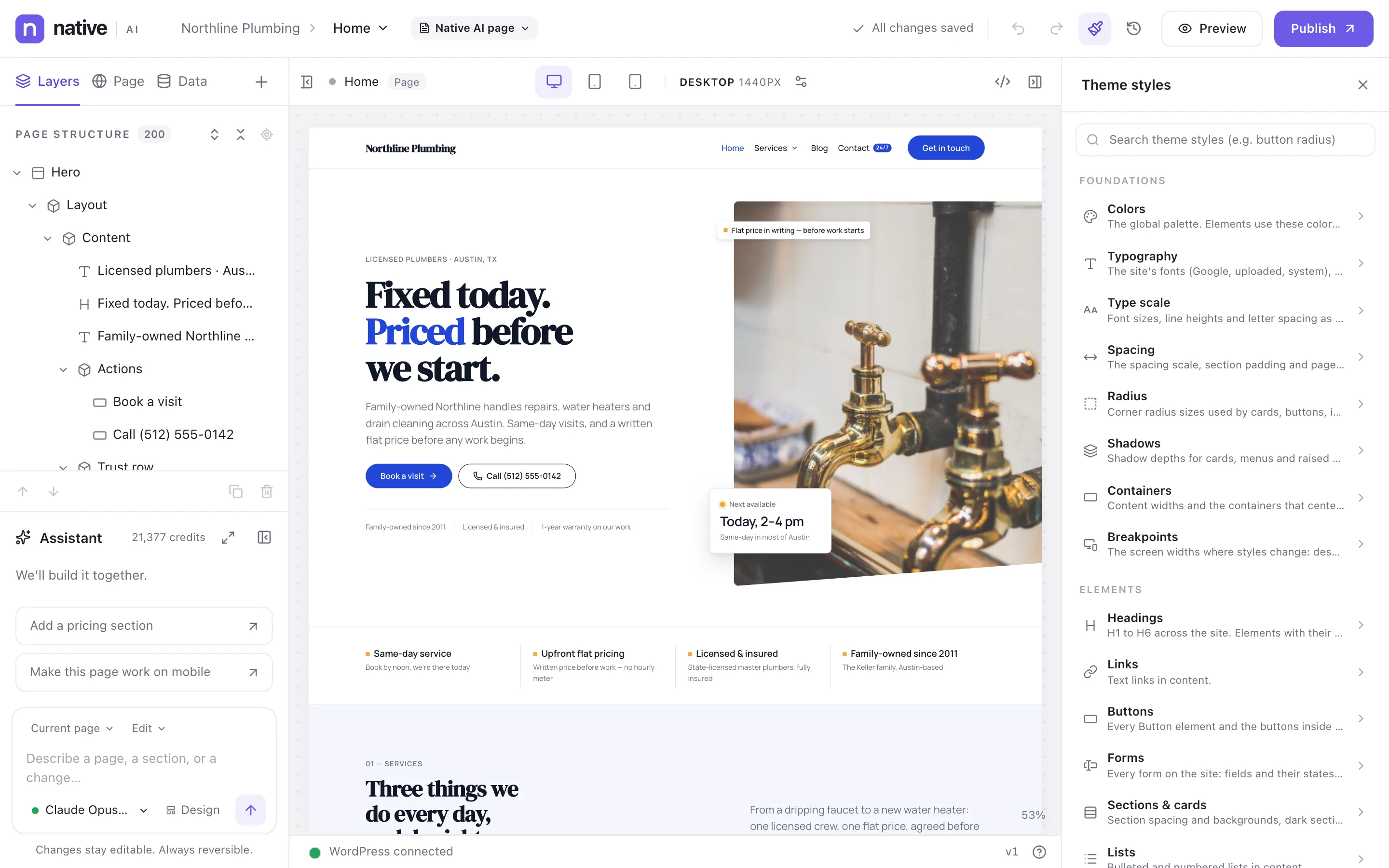
What’s in Theme Styles#
| Group | Sections |
|---|---|
| Foundations | Colors, Typography, Type scale, Spacing, Radius, Shadows, Containers, Breakpoints |
| Elements | Headings, Links, Buttons, Forms, Sections & cards, Lists, Tables, Images, Navigation, and Element types (the default look of any element, such as every Card or every Testimonial) |
The search box at the top finds any section, style or token by name — “button radius”, “link hover” — jumps to it and highlights it.
Foundations#
Colors, fonts, sizes and spacing are design tokens: named values the rest of the site uses. Change Primary and every button, link and heading that uses it changes with it. See Colors, fonts and the type scale.
Element defaults#
- Headings H1–H6, links (normal and hover), lists, tables and images.
- Buttons — each button chooses a variant (primary, secondary, outline…) and every button of that variant follows Theme Styles → Buttons.
- Forms — fields and their focus and error states, labels, descriptions, placeholders, checkboxes and radio buttons, error and success messages, step numbers and the progress bar. Every form uses them; each form can still be styled on its own.
- Sections & cards, and dark sections: inside a section with a dark background, text, muted text, links and eyebrows switch to their on-dark colors automatically.
- Navigation — how menus behave by default across the site: what opens dropdowns, animations, arrows, the breakpoint where menus collapse and the mobile menu’s style. See Menus and mega menus.
- Element types — a default look for any kind of element.
What wins#
From weakest to strongest: an element’s built-in look, then Theme Styles, then classes, then the element’s own local styles. So Theme Styles set the default, and anything you set on a class or an element still wins.
Who can change them#
Theme Styles, tokens, classes and breakpoints need the Change the design system permission, because they affect every page. See Roles and permissions.
Related articles
On the features pages
Still have a question? Email us at support.