DocsGetting started
A tour of the builder
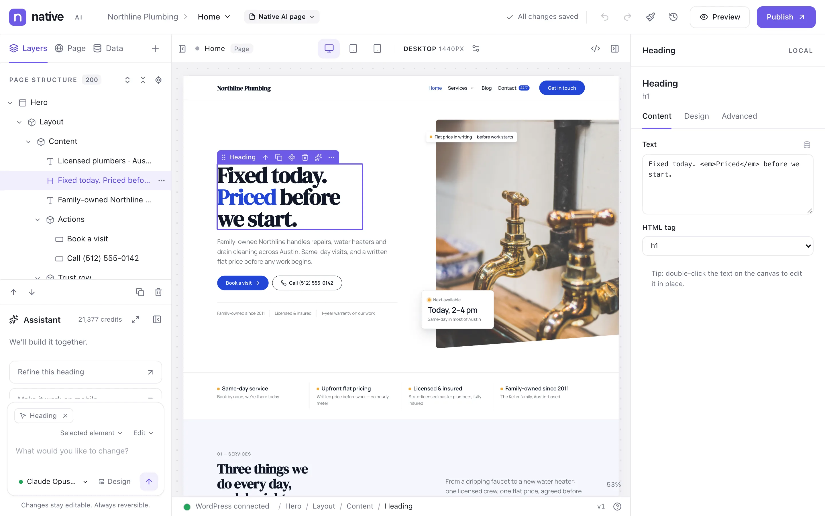
Where everything is in the builder: the top bar, the Layers, Page and Data tabs, the assistant, the canvas and the element settings.
Open any page with Edit with Native AI — from the Pages list, the admin bar or Native AI → Dashboard. The builder opens with the page in the middle, the page’s structure and the assistant on the left, and the selected element’s settings on the right.
Top bar#
- The site and the document you’re editing. Click the document’s name to switch to another page, a site template or a Global Block.
- The layout chip (“Native AI page”, “Custom layout”) says where this post’s design comes from. See Native AI and WordPress posts.
- Save status — “All changes saved” when autosave has stored everything.
- Undo and redo, Theme Styles (the brush) and History and versions (the clock).
- Preview opens the page as visitors will see it, with your latest changes. Publish makes them live.
Left column#
- Layers — the page structure as a tree. Select, rename, reorder, hide and lock elements here. See Add and arrange elements.
- Page — the page’s title and URL, Use as the front page, and lists of the site’s pages, site templates and Global Blocks to open. It also links to the design system and to Build a new website with AI.
- Data — data sources: APIs and static data. See Data from APIs and static JSON.
- + opens the element library: Elements, Loops and Forms, with Global Blocks and saved components.
Below the tabs is the assistant, with your credit balance. Press ⌘K (Ctrl+K on Windows) to jump to it. See Use the AI assistant.
Canvas#
The canvas shows the real page — your header, footer, fonts and data. Click an element to select it; double-click text to edit it in place; right-click for commands. A selected element shows a small toolbar: drag to move, Select parent, Duplicate, Convert to global block, Delete, Ask AI about this element and more actions.
Above the canvas: the breakpoint buttons (desktop, tablet, mobile and any you add), the width you’re styling (“DESKTOP 1440PX”), Manage breakpoints, the page’s HTML and CSS, and buttons to hide or show the side panels.
Right panel#
The selected element’s settings, in three tabs: Content, Design and Advanced. Content opens when you select something. The label at the top — Local or a class name — says whether design changes go to this element or to a shared class. See Content, Design and Advanced settings.
Status bar#
At the bottom: whether WordPress is connected, the selection path (Hero / Layout / Content / Heading — click any part to select it), the saved revision of the document, and Keyboard shortcuts.
Make room#
Drag the inner edge of a side panel to resize it; double-click the edge to reset it. The widths are remembered. In a narrow window the builder switches to a compact layout where each panel opens as a drawer over the canvas.
Related articles
On the features pages
Still have a question? Email us at support.