DocsDesign system & media
Design tokens and classes
Tokens are named values — colors, sizes, spacing — and classes are named groups of styles. Use them, and a change in one place updates every page.
Tokens#
A token is a named value: Primary is a color, 4XL a font size, Space 8 a spacing step. Elements, classes and Theme Styles refer to tokens by name, so changing a token’s value changes it everywhere at once. In the Design tab, controls offer the tokens that fit the property first (“Token: 4XL · clamp(…)”) — or you can type your own value.
The design system panel#
Open it from the Page tab (Site → Design system). It has three tabs: Tokens, Classes and Interactions (your interaction presets).
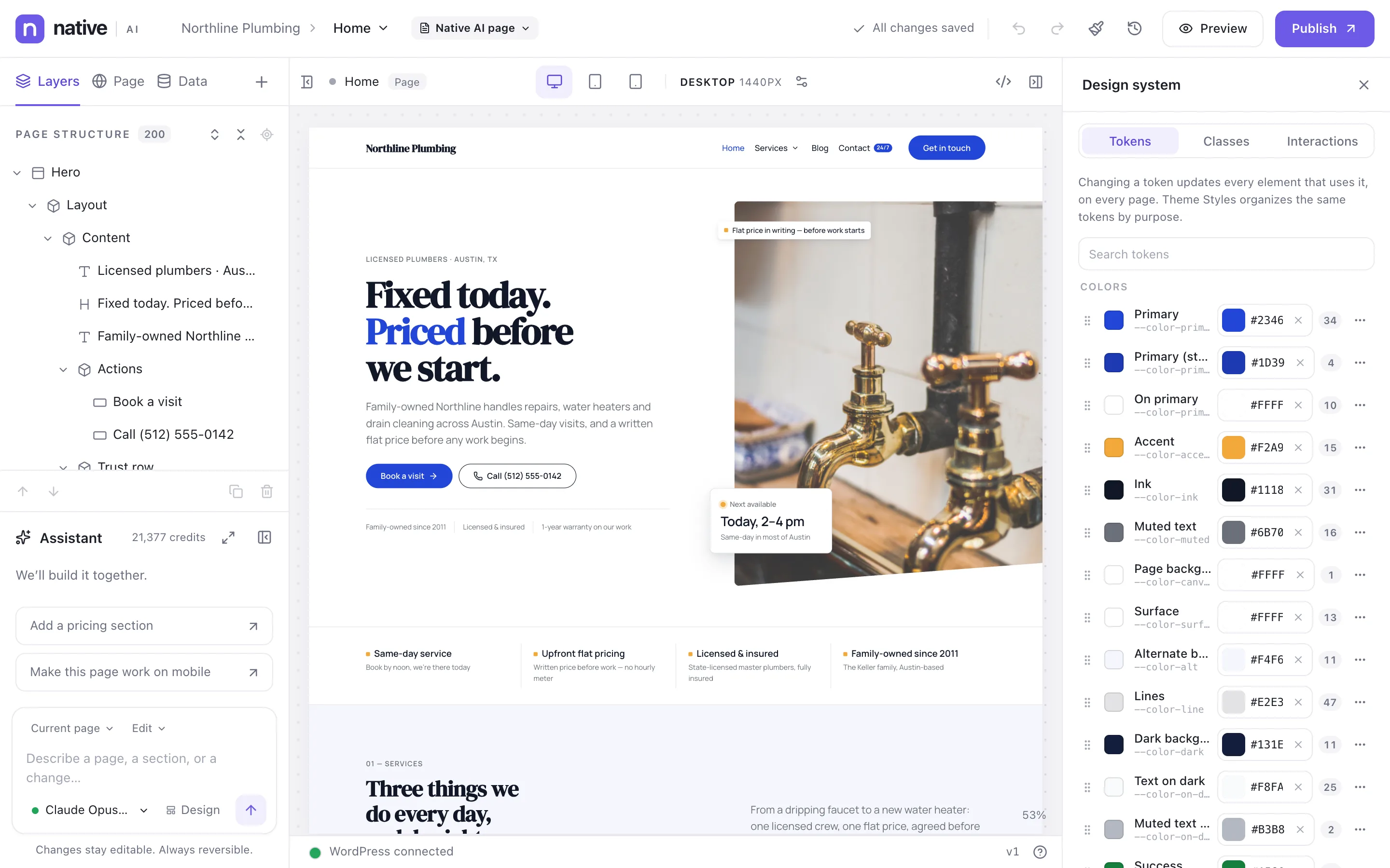
- Each token shows its value — per breakpoint if it changes — and how many places use it, counted across the design system and every page, template and block. You know what a change will touch before you make it.
- Add, rename, duplicate, reorder and delete tokens. A token that’s still used somewhere can’t be deleted.
Classes#
A class is a named set of styles, like .card or .eyebrow, that any element can use. Elements can have several. To style a class, select an element that has it and pick the class at the top of the right panel instead of Local; the panel says how many elements the change reaches.
A new site starts with classes for layout (section, container, stack, cluster, grid-2, grid-3…), text (eyebrow, text-lead, text-muted…), buttons (btn, btn-primary, btn-outline…), cards, the header and the footer. System classes such as btn and btn-primary can be restyled but not renamed or deleted, because buttons rely on them.
When to use what#
| You want to change… | Change |
|---|---|
| A value used across the site (the brand color, a font size) | The token |
| How every element of a kind looks (all H2s, all buttons) | Theme Styles |
| A look some elements share (feature cards, a highlighted band) | A class |
| One element only | Its local styles |
The AI follows the same rule: for a site-wide request, it changes the highest shared level that covers it — Theme Styles, then a class, then a Global Block or template — before touching individual elements.
Related articles
On the features pages
Still have a question? Email us at support.