DocsThe builder
Style elements with the Design tab
Layout, size, spacing, typography, backgrounds, borders, effects and position — per breakpoint and state, on one element or on a class that styles many.
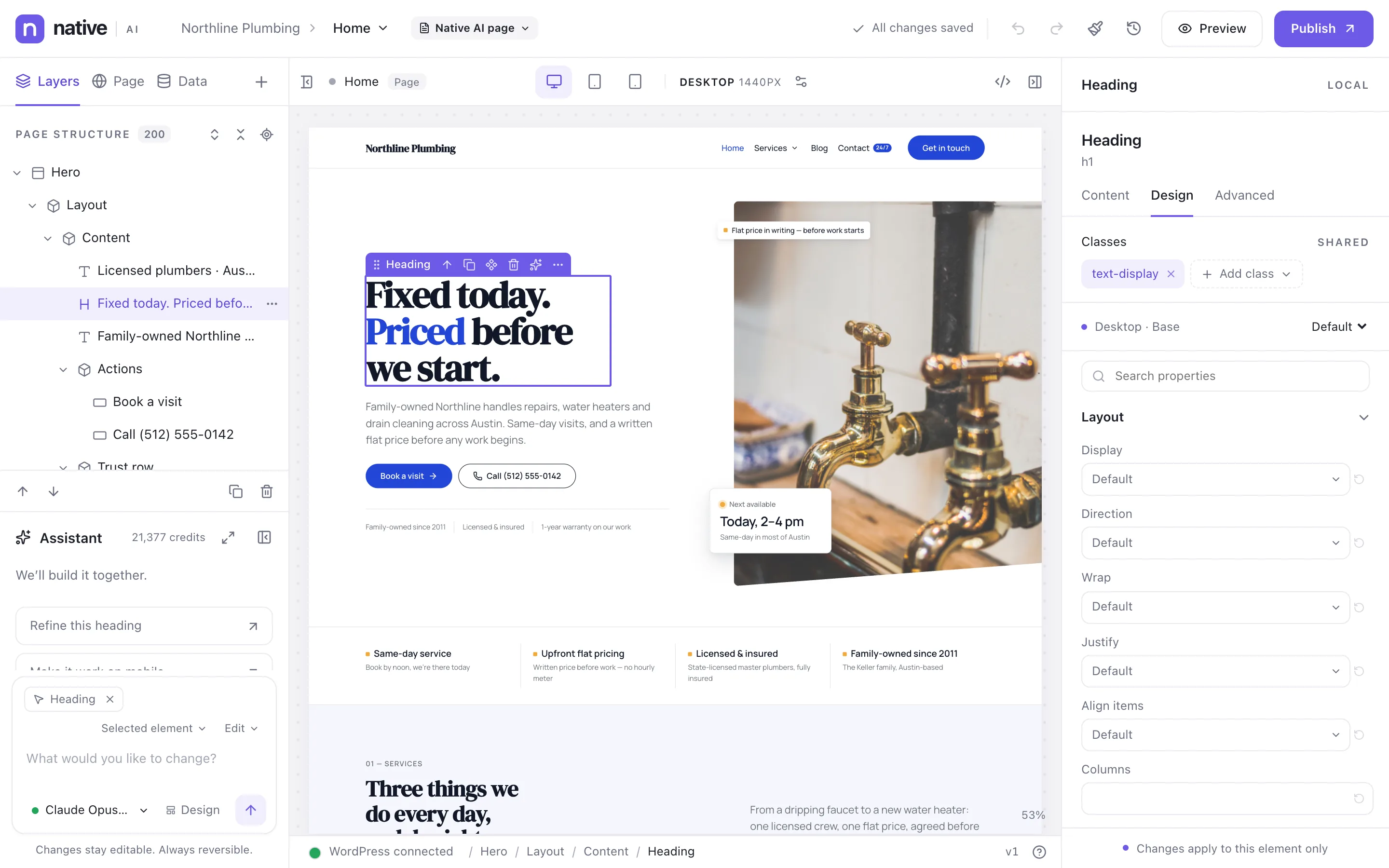
Groups and search#
Properties are grouped as Layout, Size, Spacing, Typography, Background, Borders, Effects and Position. Type in the search box at the top of the tab to jump to any property by name (“letter spacing”, “z-index”).
Everything you’d expect from CSS is there, including grid areas, sticky and absolute positioning, transforms, masks, filters, backdrop blur, aspect ratio and scroll snapping — and it’s all validated, so an invalid value can’t break the page.
Tokens or your own values#
- Controls offer your design tokens first — a color from the palette, a spacing step, a font size (“Token: 4XL”). Change the token later and every element that uses it follows. See Design tokens and classes.
- Or type any value:
px,rem,em,%,vw,vh,svh,ch, keywords, or an expression likeclamp(2rem, 5vw, 4rem). Arrow keys step numbers up and down. - The color picker has the palette, opacity, HEX/RGB/HSL and an eyedropper; New global color adds the color to the palette.
On this element, or on a class#
The label at the top of the right panel says where your changes go. Local means this element only. Choose a class to style it instead: the panel then says “Editing .card — changes apply to 12 elements in open pages”, so you know the reach before you change anything. Elements can have several classes. See Design tokens and classes.
States#
Style how an element looks when it’s hovered, focused with the keyboard or pressed: pick Default, Hover, Focus or Pressed above the properties. Only what you set for a state changes; everything else stays as in Default.
Elements that interactions put in a state — open, active, scrolled, copied, expanded, or a state you named — can be styled for that state too, and the canvas previews it while you edit.
Parts#
Elements made of several pieces expose them as parts you can style separately: a menu’s links, dropdowns and mobile panel; a popup’s content area and overlay; a heading’s emphasized and marked words (so one italic word in a headline is native and editable).
Breakpoints#
Styles are per breakpoint. What you set on Desktop applies everywhere unless a smaller breakpoint overrides it, so on tablet and mobile you only set what changes. See Responsive design and breakpoints.
Copy, paste and reset styles#
- Copy styles (⌥⌘C) and Paste styles (⌥⌘V) give one element another’s look — every state, part and breakpoint — while it keeps its own text, links and media.
- Reset styles removes the element’s local styles.
Related articles
Still have a question? Email us at support.