DocsTemplates & site structure
Menus and mega menus
Build site menus with icons, badges and descriptions, show them as dropdowns and mega menus made of real elements, and give phones a proper mobile menu.
A Menu element shows a menu; the menu itself — its items — is kept separately, so one menu can appear as a header bar, a footer column and a mobile panel, each with its own look.

Where the items come from#
| Source | What it is |
|---|---|
| Site menu | Items you edit in Native AI. Mirrored into a WordPress menu so themes and other plugins can show it too. |
| WordPress menu | A menu from Appearance → Menus, read live. Copy here turns it into a site menu to add icons, badges and mega menus (the original stays). |
| Automatic | Your pages with their hierarchy, the latest posts of any type, or the terms of any taxonomy (categories, product categories…). |
Edit the items#
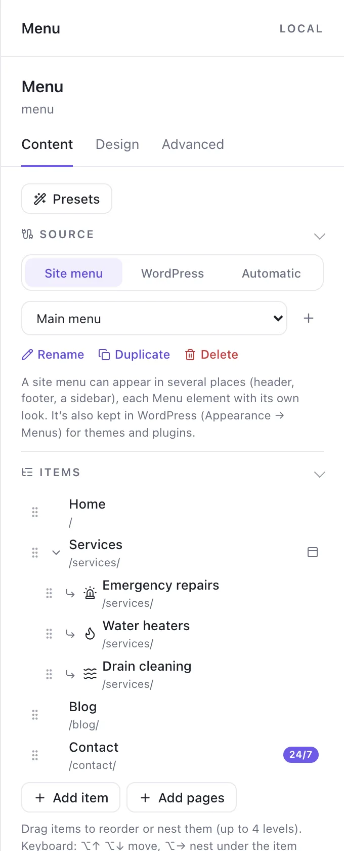
Select the Menu and open Content → Items: a tree you drag to reorder and nest (up to four levels). Each item has:
- A label (dynamic data allowed: “Hi, {user_name}”) and a link — a page, post, category, the blog, a section on the page, a file, an email, a phone number, a popup or a URL. Links to your content follow it when its address changes.
- A description, an icon (before, after, or icon only) and a badge (“New”, “24/7”) in a tone: brand, neutral, success, warning, danger or info.
- Display conditions — show an item only to logged-in visitors, or on some pages — and hidden items.
- A mega menu panel (top-level items).
Keyboard: ⌥↑ ⌥↓ move an item, ⌥→ nests it under the item above, ⌥← un-nests it, Enter edits, F2 renames, Delete removes. Add several pages at once saves time on big sites.
Dropdowns and flyouts#
Choose whether dropdowns open on hover, click or both (and on keyboard focus), the delays, where they open, their animation (fade, slide down, slide up, scale, fade up, or none) and arrows (chevron, caret, plus). Flyouts open to the side and flip to stay on screen. The current page is marked, and so is the section it belongs to — /services/web-design/ marks “Services”.
Mega menus#
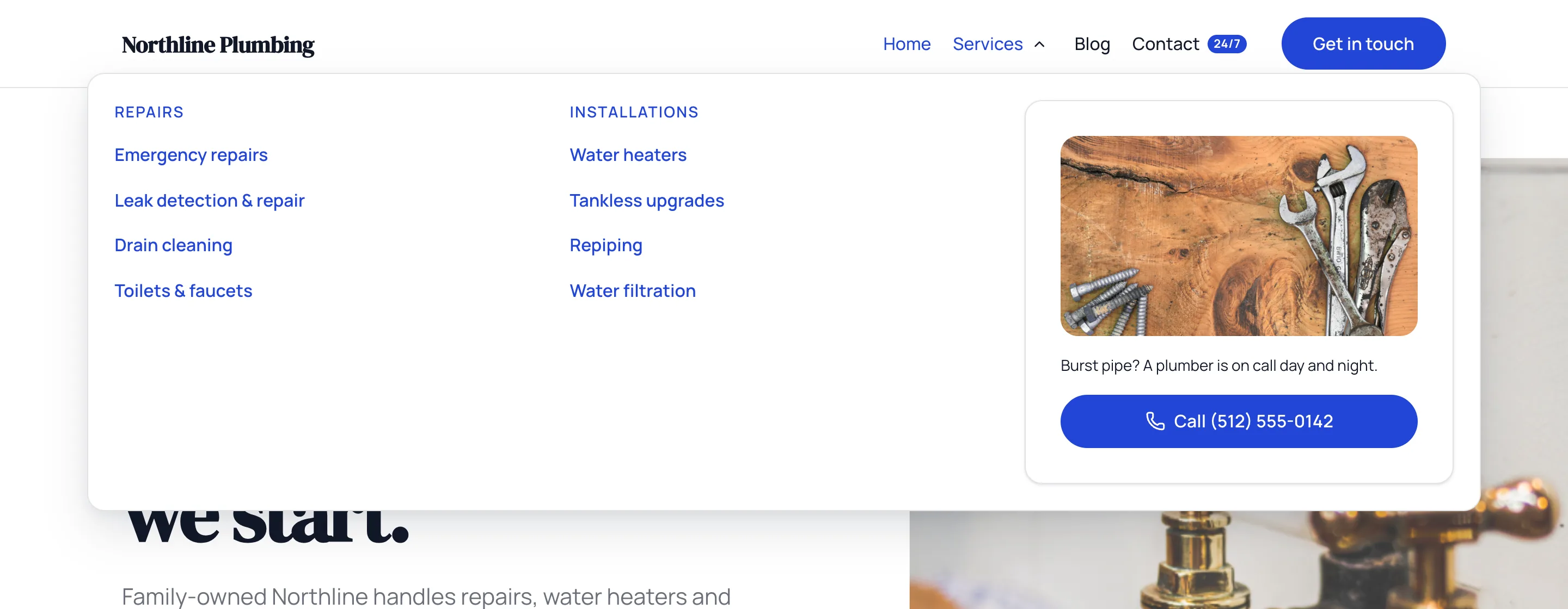
A mega menu is a panel of normal elements attached to a top-level item: columns of links, an image card, a button, a Query Loop of the latest posts, a form, or a Global Block. Start from a layout (the item’s own sub-items as columns, featured + links, latest posts, a Global Block, blank), choose its width (the content’s, the site’s or full width), and click Edit mega menu to design it open on the canvas.
On phones#
- Choose the breakpoint where the menu collapses into a menu button (or always, or never).
- The mobile menu drops down, slides in off-canvas from either side, or covers the full screen.
- Sub-items open as an accordion, as slide-in panels with a Back button, or always expanded.
- The Menu Trigger element is the same menu button, placed anywhere you like.
Site-wide defaults and presets#
Theme Styles → Navigation sets how menus behave across the site; a menu set to “Site default” follows it. Nine presets restyle a menu while keeping its items: Minimal, SaaS, Corporate, Editorial, Centered, Transparent header, Mega menu, Full screen and Off-canvas.
Related articles
On the features pages
Still have a question? Email us at support.